AMBIANCE
Typeface Design
Motion Graphics
OVERVIEW
Ambiance is designed from scratch and follows a rigid grid. It uses slender lines and often ends with a circle to represent a bulb or a globe light.
CASE STUDY VIDEO
01. MOTIF
INSPIRATION
My inspiration came from modern light fixtures and minimal interior design. A prominent feature was their abundant use of slender, uniform lines and smooth curved edges.

CORE CONCEPT
Typeface imitates the aesthetics of minimal interior design, particularly light fixtures, characterized by its use of slender lines and simple shapes. It eliminates any extraneous elements in the letters that don’t contribute to their recognition.
CHARACTERISTICS
Consistent thin lines
Smooth rounded corners
End with circular forms
Occasional curves
02. LETTER SETS


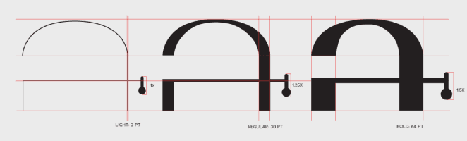
03. VARIABLES
With the different variables it’s important to maintain a grid for structure.


ITALICS
Ambiance, when italicized, tilts 9 degrees clockwise. This rule applies to all the variables and weights.


WEIGHTS
Enhance the readability and contrast on various backgrounds using the different weights of Ambiance. On a dark background, using regular or bold would be more appropriate but is not limited.

MODES
Dark mode could have the type circles lit up to look like globe lights or bulbs.
Light mode would just be in black with no gradient.

04. STRUCTURE
ABSTRACT STRUCTURE
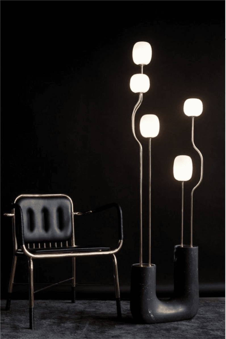
The circles at the end of lines in the character resemble globe lights; with the addition of the rounded rectangle, it resembles a bulb and a socket. Curved lines may resemble the stand of a floor lamp while straight lines may represent that of a ceiling light.
The triangles in some characters resemble a base. Instead of a flat base, the use of a curved triangle brought some organic angles in contrast to all the rounded shapes.


CHARACTERS
WEIGHTS

05. APPLICATIONS
WEBSITE DESIGN


SOCIAL MEDIA

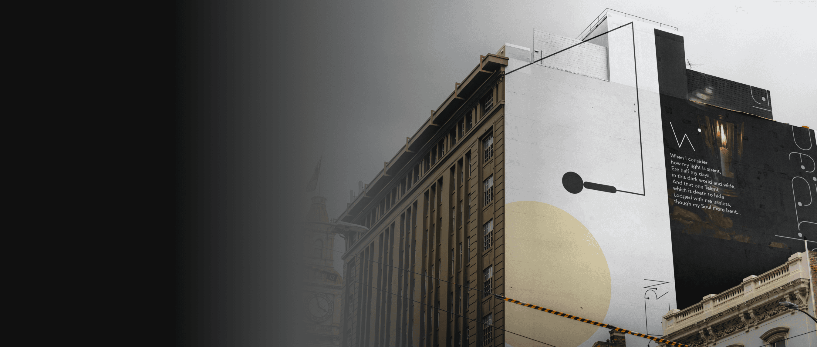
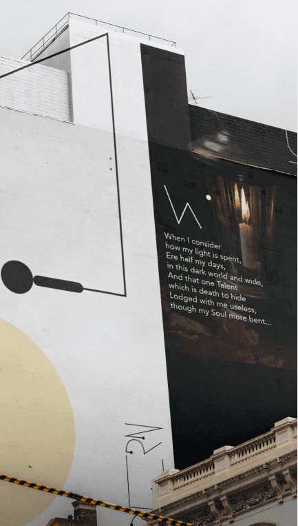
EDITORIAL DESIGN


PACKAGE DESIGN


