Dynamic Branding
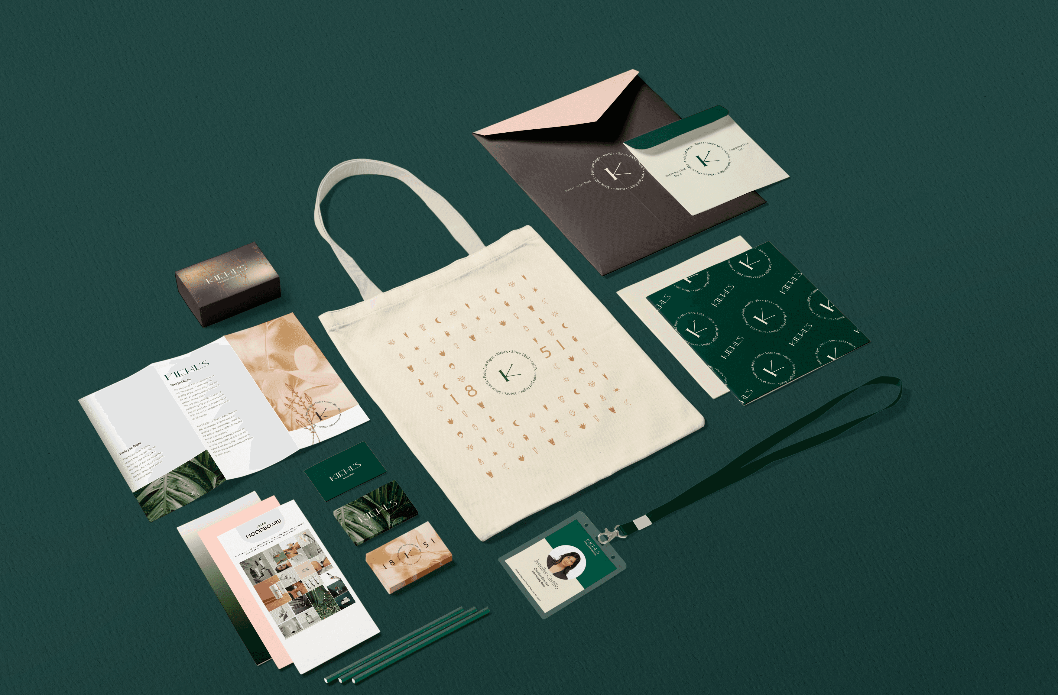
Package Design
Kiehl's LLC is an American cosmetics brand retailer that specializes in skin, hair, and body care products.
OVERVIEW
Kiehl’s rebranding includes a redesigned logo, a new color palette and simpler and modern products targeted toward both male and female. Our rebranding also includes seasonal products and dynamic branding.
TEAM
Ibtida Hasib
Annie You
Radiya Aheto
MY ROLE
Research
Visual Identity
Applications

CHALLENGES
Outdated logo and inconsistent aesthetics between lettermark, wordmarks, and visuals.
Inconsistent color palette.
Confusing packaging disrupts understanding of individual skin needs.
SOLUTION
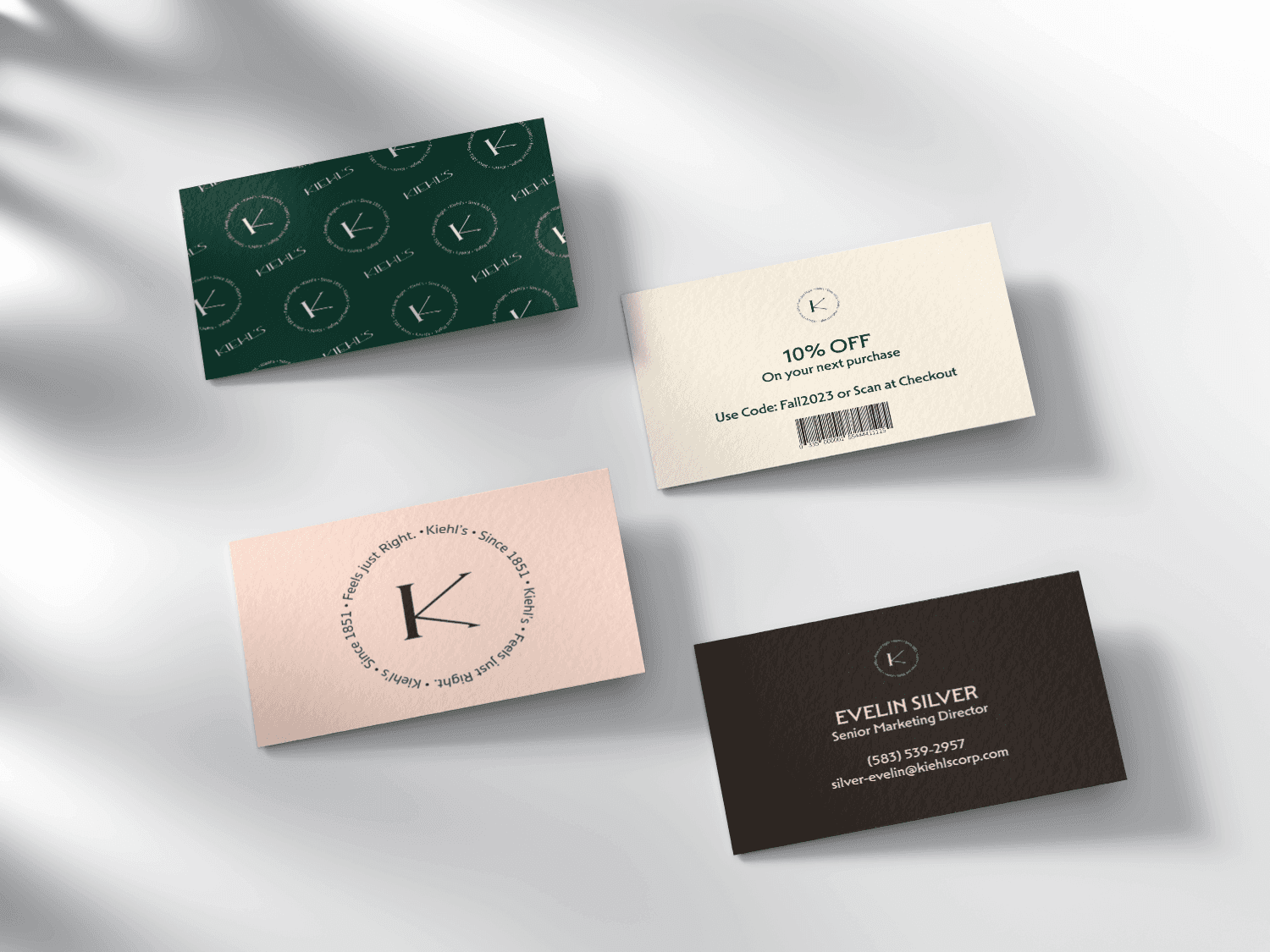
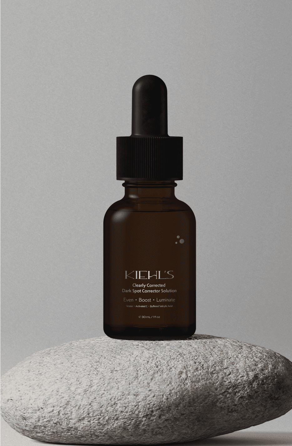
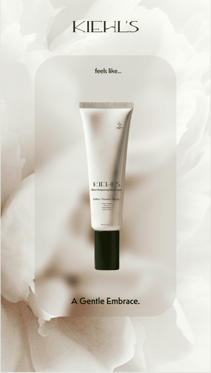
Logo designed using all uppercase and serif font with high contrast to reflect luxury.
Earthy colors to match brand archetype.
01. RESEARCH
CURRENT BRANDING


COMPETITOR’ S ANALYSIS


TARGET MARKET
Primary: 18-50 year old males
Secondary: 18-50 year old females

02. BRAND IDENTITY
VISION
The branding strategy focuses on positioning Kiehl's as a brand with natural products, high expertise in skincare and involvement with local social causes.
POSITIONING STATEMENT
For 18-50 year old adults, Kiehl’s is the cosmetic brand that offers versatile options for all genders, because they want to ensure that they have something for everyone.

TONE OF VOICE
Exclusive
Unisex
Minimal
ARCHETYPE
SAGE 40%
CAREGIVER 60%
BRAND TAGLINE
Kiehl’s. Feels just Right.
DESIGN PRINCIPLE
Use of Serif for heading to show tradition, sophistication and luxury.
Use of curvy lines to show fluidity.
Earthy tones to bring a feeling of tranquility.
MAIN WORDMARK

COLOR PALETTE

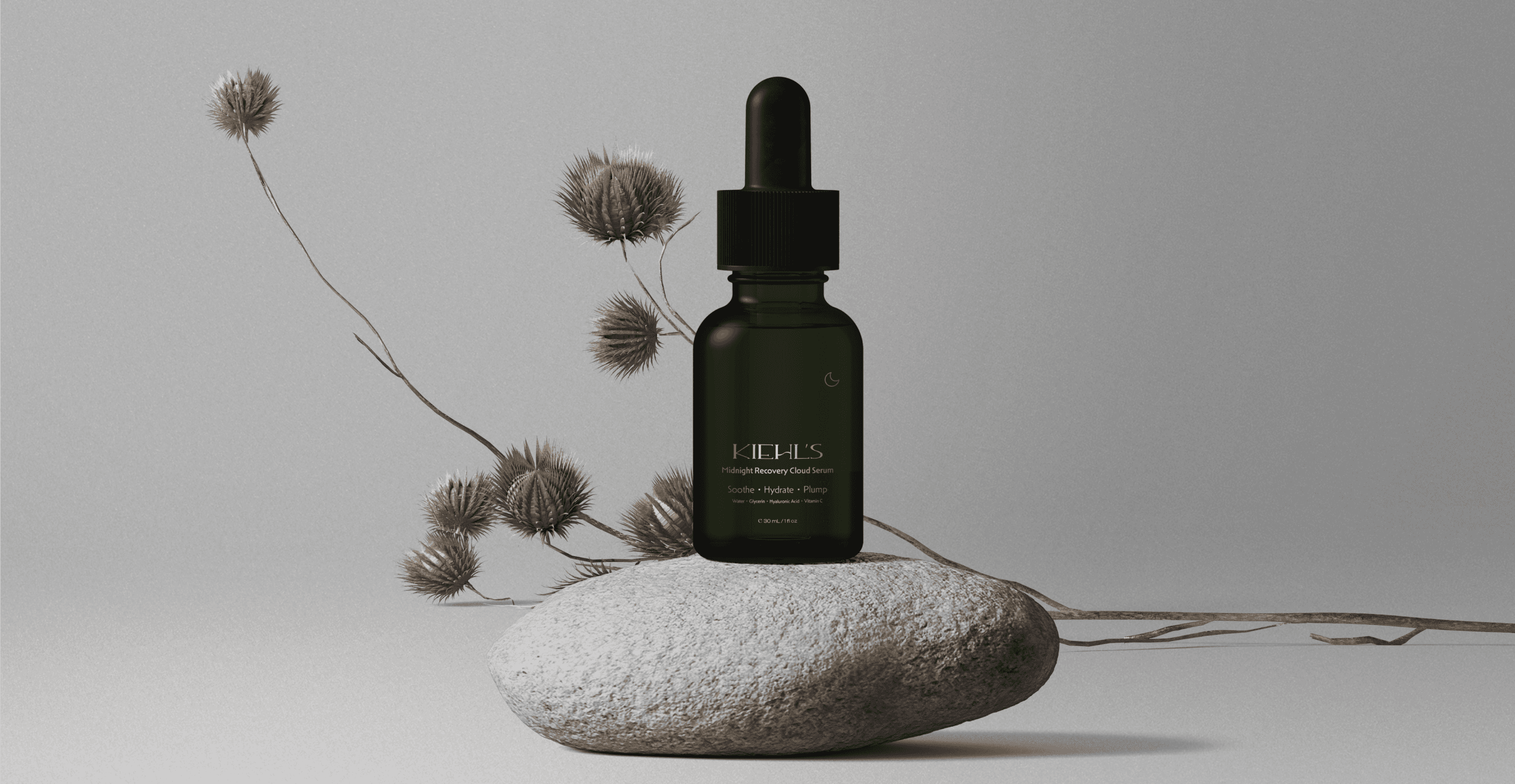
Dark earthy tones of brown and green are used to bring out the use of natural ingredients. Both colors are paired with a light color for gradients.

LOGO IN MOTION
PHOTOGRAPHY STYLE

04. APPLICATIONS
IN STORE


PRODUCTS


WEB AND OUT OF HOME POSTERS


OFFICE AND LAB STATIONERY