OVERVIEW

While confirming a reservation at a restaurant is easy, finding the right restaurant can be challenging, especially when customers are presented with a large selection. Our objective is to make restaurant exploration fun while making the selection process faster and easier. 


TEAM

Ibtida Hasib

Annie You

Radiya Aheto

Elijah Hassan

MY ROLE

Research

User Persona

Wireframe

User Flow

UI Design

TOOLS

Miro

Figma

UX Research

UX Design

Opentable is a platform for restaurant reservation that allows a one stop dining experience for customers.

UX DESIGN

OVERVIEW

While confirming a reservation at a restaurant is easy, finding the right restaurant can be challenging, especially when customers are presented with a large selection. Our objective is to make restaurant exploration fun while making the selection process faster and easier. 


TEAM

Ibtida Hasib

Annie You

Radiya Aheto

Elijah Hassan

MY ROLE

Research

User Persona

Wireframe

User Flow

UI Design

CHALLENGES

The app UI doesn’t invoke hunger as there are more pictures of restaurant interior compared to food.

While red is an appetizing color, a combination of red and white is not.

Typeface choice is clean but it’s sharp. Icon set is not consistent.

SOLUTION

Use of appetizing warm colors like red and yellow.

Make it visually appealing by using gradients.

Use of rounded typefaces to appear welcoming and friendly.

PROCESS AND TIMELINE

Month 1

01. Discover

02. Define

03. Ideate

04. Design and Development

05. Deliver

Month 2

Month 3

Month 4

CHALLENGES

The app UI doesn’t invoke hunger as there are more pictures of restaurant interior compared to food.

While red is an appetizing color, a combination of red and white is not.

Typeface choice is clean but it’s sharp. Icon set is not consistent.

SOLUTION

Use of appetizing warm colors like red and yellow.

Make it visually appealing by using gradients.

Use of rounded typefaces to appear welcoming and friendly.

01. UI DESIGN

FEATURE 1: DINDER CRAVING

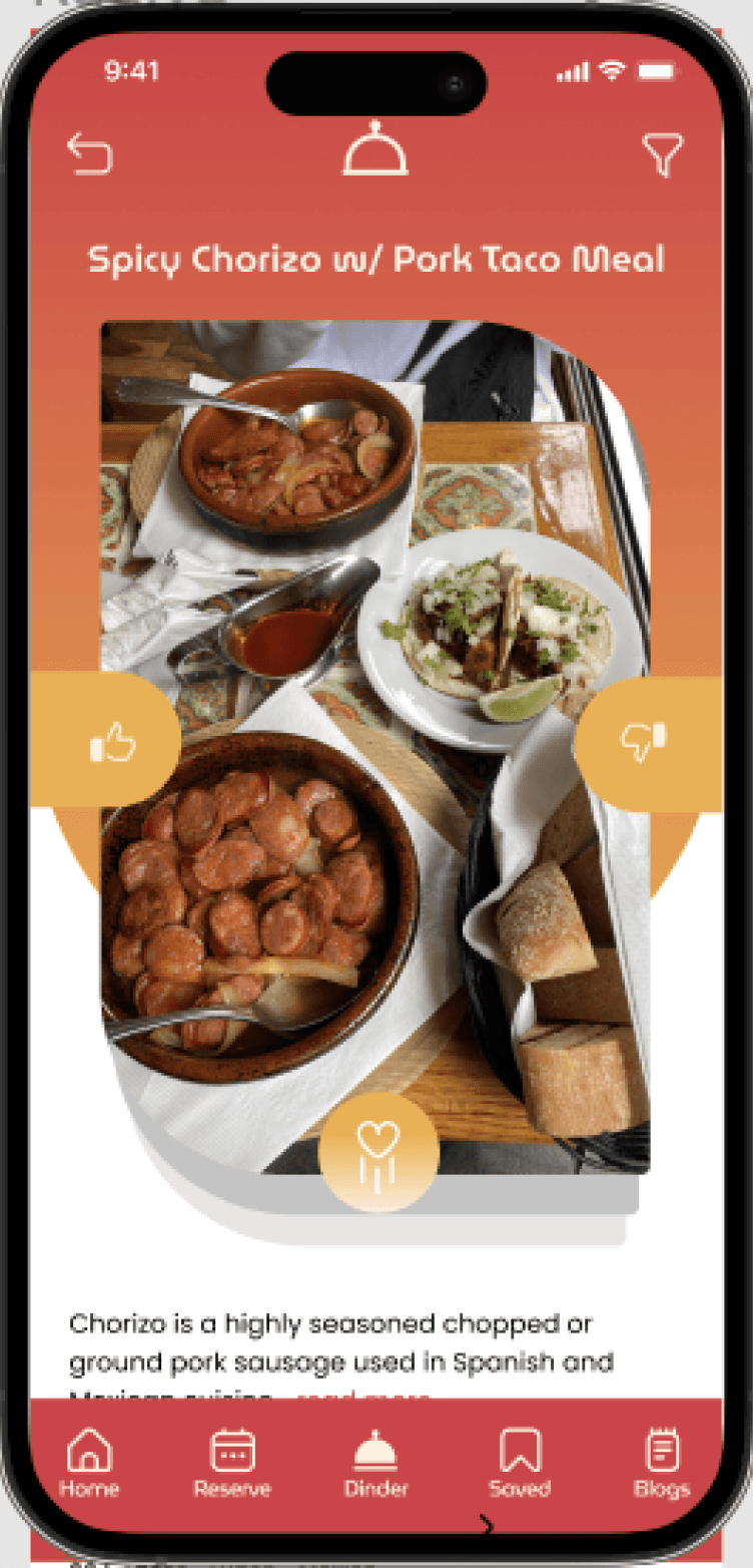
User is presented with the Dinder logo that reveals the filter page for preferences. While swiping, user could scroll down to see the details of the dish itself or the restaurant as a whole.

FEATURE 2: SOCIAL DINING INSIGHT

Under restaurant details, user is able to see and read reviews that are extracted from social media. They are also able to leave comments for others.

HOMEPAGE

HOMEPAGE

Homepage reveals any new feature or announcements for the hero. User can scroll and find most popular restaurants at the time or browse by cuisine.

OTHER FILTERS

OTHER FILTERS

There are variations within filters based on what the user is looking for.

02. ART DIRECTION

DESIGN PRINCIPLE

Invoke Hunger.
Enhance food images through appetizing colors.

Be Welcoming.
Use rounded san serif typefaces and rounded frames to appear friendly.

Be Inclusive.
Reveal small amounts of information at a time.

Invoke Hunger.
Enhance food images through appetizing colors.

Be Welcoming.
Use rounded san serif typefaces and rounded frames to appear friendly.

Be Inclusive.
Reveal small amounts of information at a time.

ARCHETYPE

03. DESIGN SYSTEM

COLOR PALETTE

Primary

Secondary

Tertiary

#DA3743

#FEF0DC

#F2B03F

#578024

#578024

#342A2A

The new Opentable app utilizes warm colors to accentuate food images, creating an inviting and energetic atmosphere for users, and make restaurants appeal for reservation.

ICONS

Characteristics of Icons


Icons have rounded edges to appear friendly and approachable.

Icons may be filled or outlined.

Large icons (24px) are used for navigation, bookmarks and likes.

Small icons (8px) are used as guides or inside filters

Characteristics of Icons


Icons have rounded edges to appear friendly and approachable.

Icons may be filled or outlined.

Large icons (24px) are used for navigation, bookmarks and likes.

Small icons (8px) are used as guides or inside filters.

TYPOGRAPHY

The use of rounded typefaces make a welcoming and friendly approach.

ILLUSTRATION STYLES

We chose a flat illustration style with simpler shapes so it is visually appealing while being subtle enough to not grab too much attention.

COMPONENTS

BUTTONS

We continued the use of rounded edges in our buttons and filters along with our lighter primary color and secondary colors.

CARD STYLES

We used gradients and incorporated different radius on certain corners of our cards in order to excite our users.

04. KEY TAKEAWAY

KEY TAKEAWAY

User testing is important.
Having users test out the product help fix errors that are overlooked.


Community is Key.
Form an informed community, where users can share their experiences and provide valuable insights to others.


User testing is important.
Having users test out the product help fix errors that are overlooked.


Community is Key.
Form an informed community, where users can share their experiences and provide valuable insights to others.

Appealing visuals is important.
When it comes to food, having an appetizing picture is essential to attract customers.

Make it exciting.
Make restaurant browsing fun is opentable’s differentiator.

NEXT STEPS

Enhance the micro interactions.

Design UI dark mode.

Increase legibility.


Designed by Ibtida Hasib © 2024 All Rights Reserved.

Designed by Ibtida Hasib © 2024 All Rights Reserved.

Designed by Ibtida Hasib © 2024 All Rights Reserved.

Designed by Ibtida Hasib © 2024 All Rights Reserved.