Responsive Design
Interface Design
Design System
Ecommerce Website
Ray-Ban is a brand of luxury sunglasses and eyeglasses created in 1936 by Bausch & Lomb.
OVERVIEW
While Rayban has strong branding by itself, the website can be challenging to navigate. There are a lot of options which can be hard to choose from and repeated information on the homepage can confuse users even more.

CHALLENGES
SOLUTION
Making the website more mobile friendly by making iconic products pop more and using dynamic branding elements to invite user interest.
Sorting products in a different manner than currently done, making the site easier to browse regardless of the format.
01. RESEARCH
BRAND MISSION
Representing Timeless style, Authenticity and Freedom of expression, “Luxottica's mission is to protect the eyes and enhance the look of women and men in the world, creating the best possible eyewear to satisfy its clients and interpret consumer tastes and aspirations.”
COMPETITOR’ S ANALYSIS
While brands like Oliver’s people and Christopher Cloos have a simple and minimalist website with a neutral color palette, brands like Oakley and Warby Parker are use bold colors. Most of the brands use a combination of serif and san serif typeface. All the websites have sharp rectangle frames.
ARCHETYPE

TARGET MARKET
Male & Female
Aged 20-50
People wanting stylish optical lenses
People who like customizational glasses
Fashionable Individuals
Individualists
Musicians
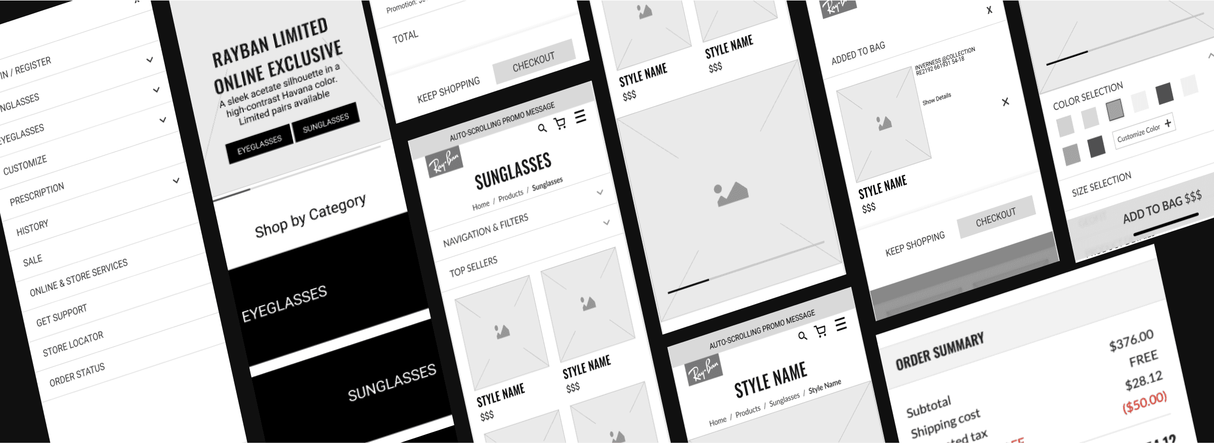
02. WIREFRAMING
03. UI DESIGN
DESIGN PRINCIPLE
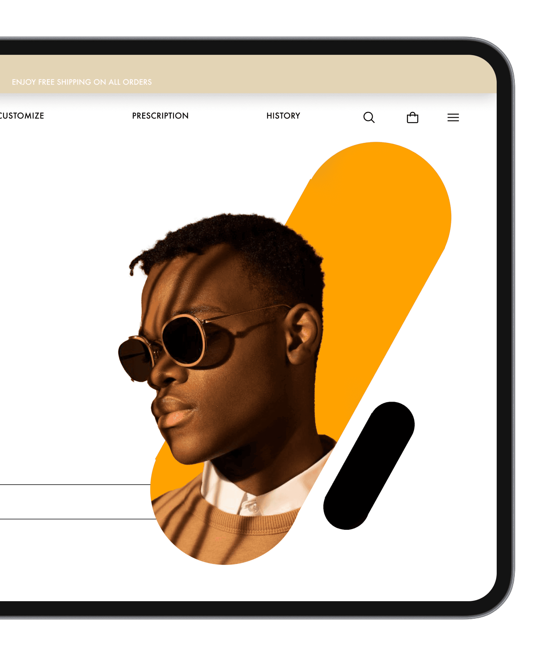
Thw website redesign has a duo toned color palette with sharp and rounded rectangles. It has a combination of vertical and horizontal type with headlines often in a combination of 2 type treatments.
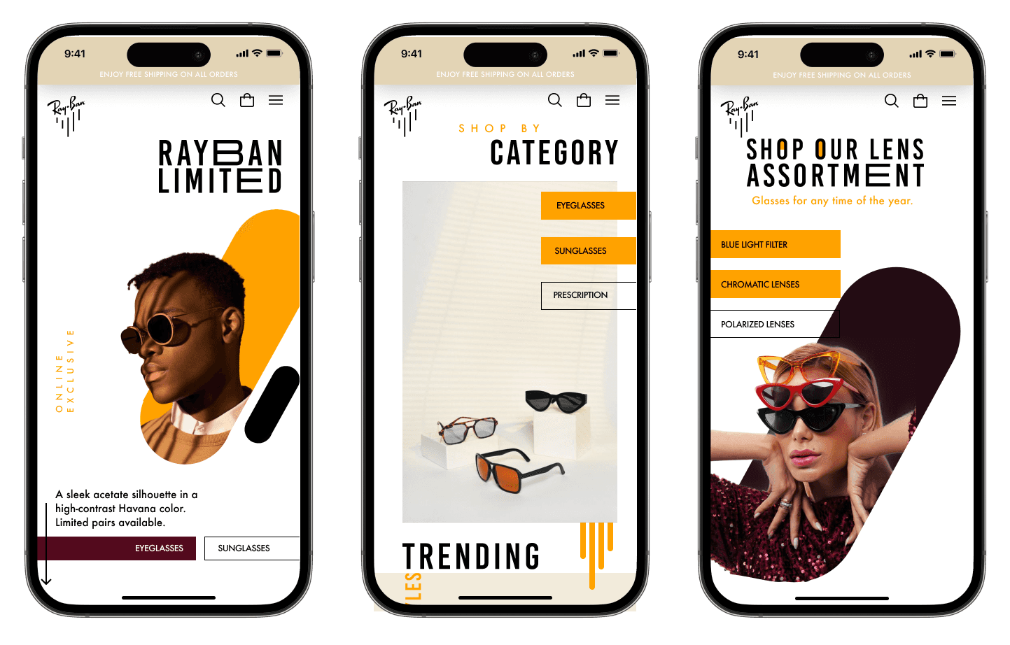
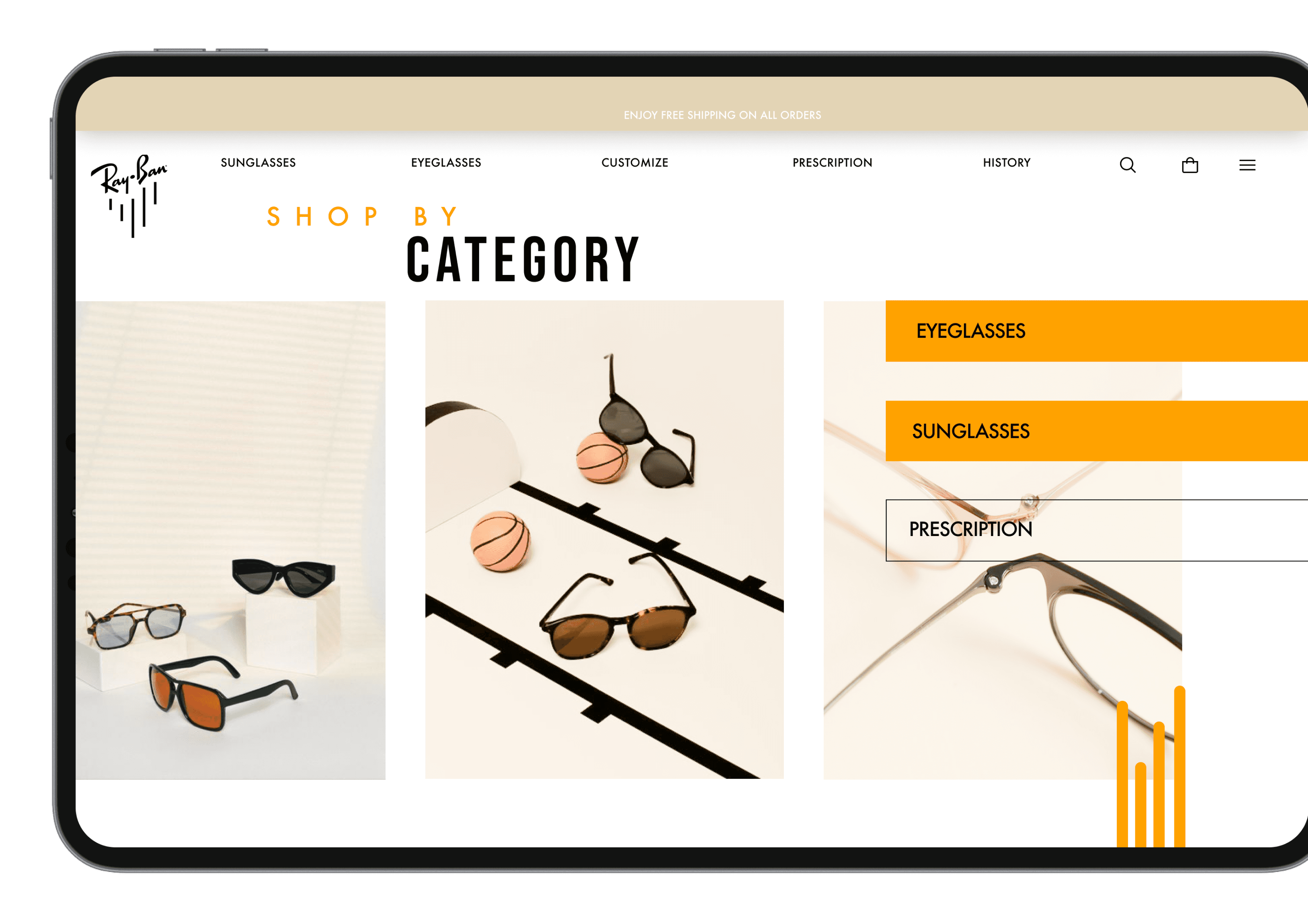
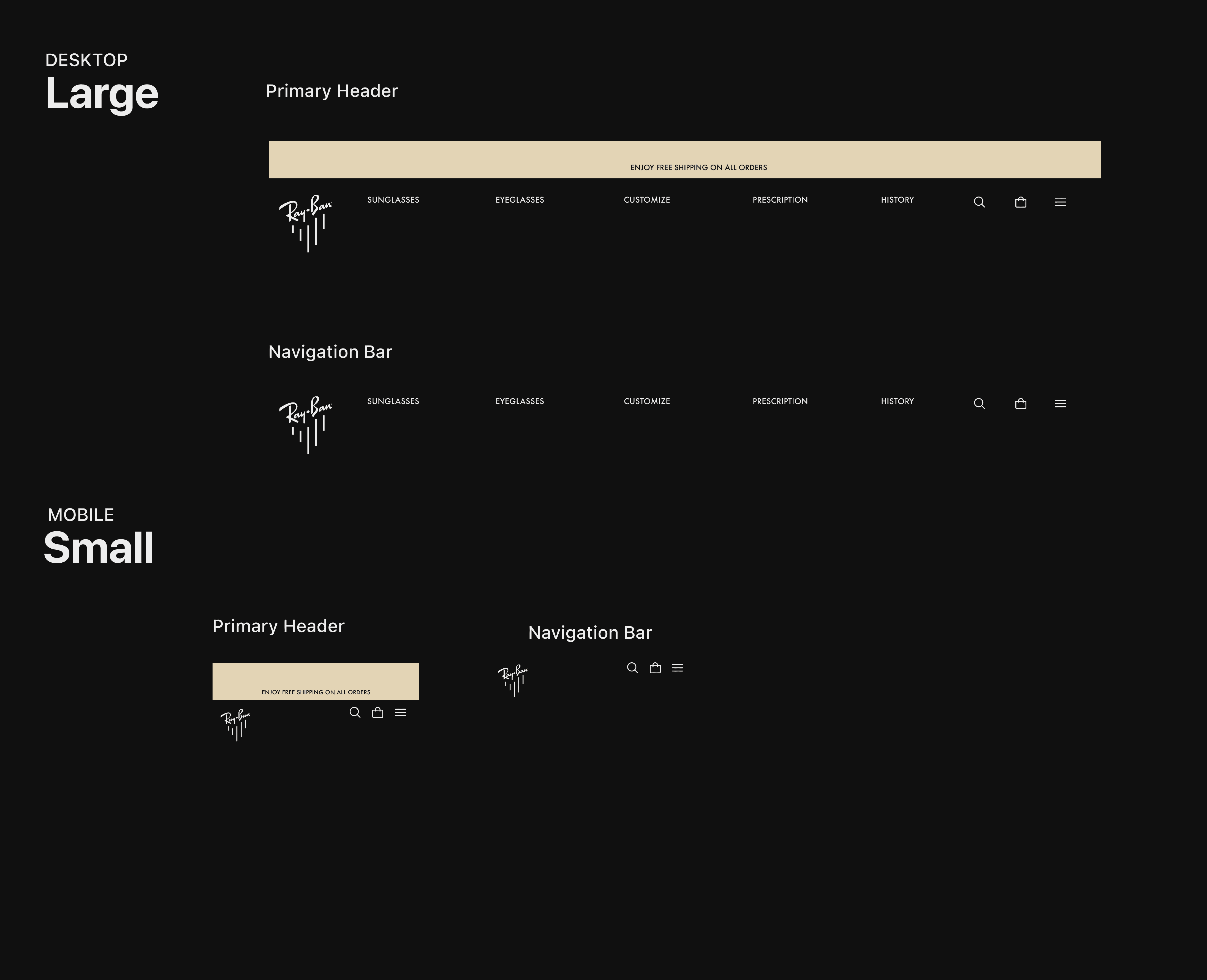
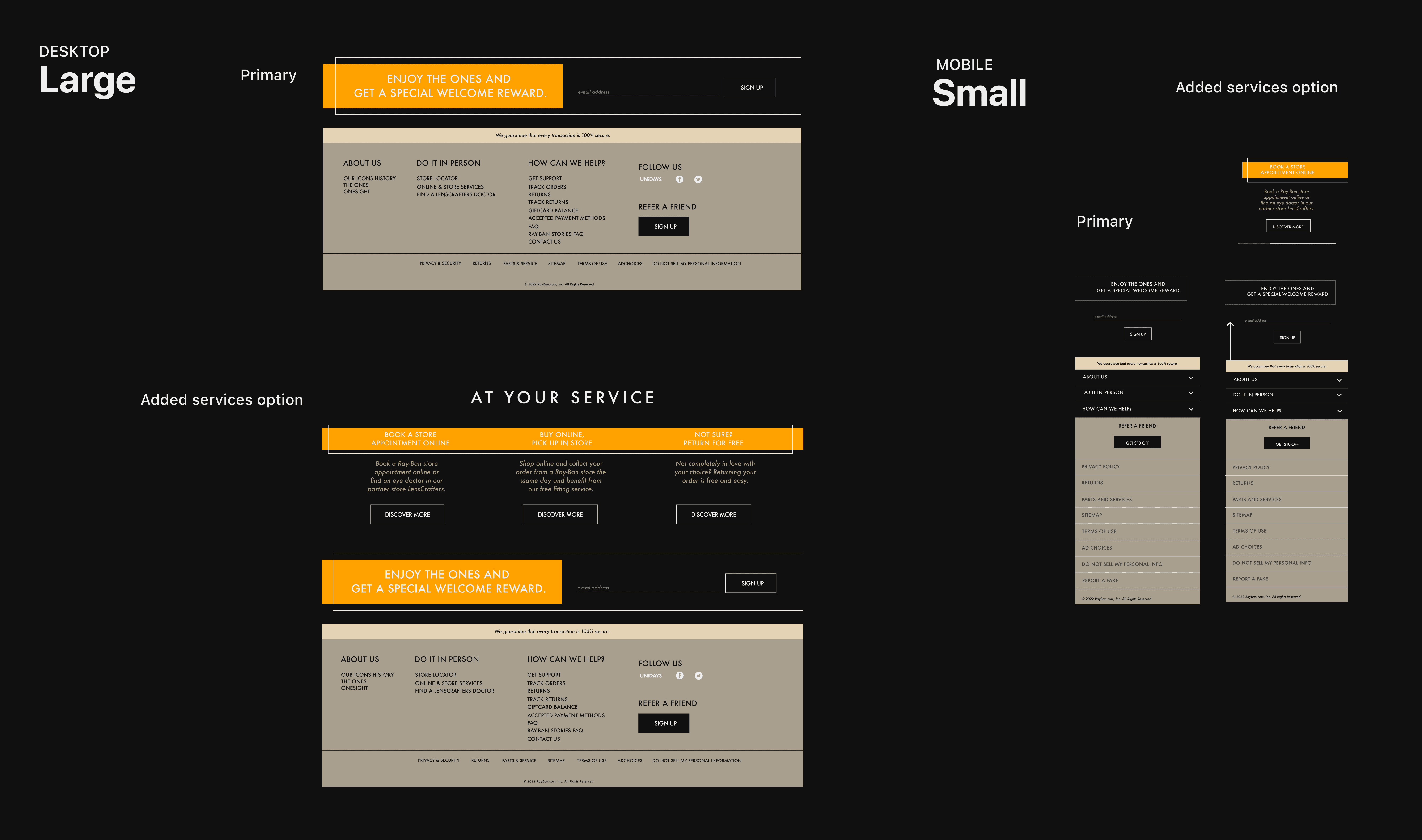
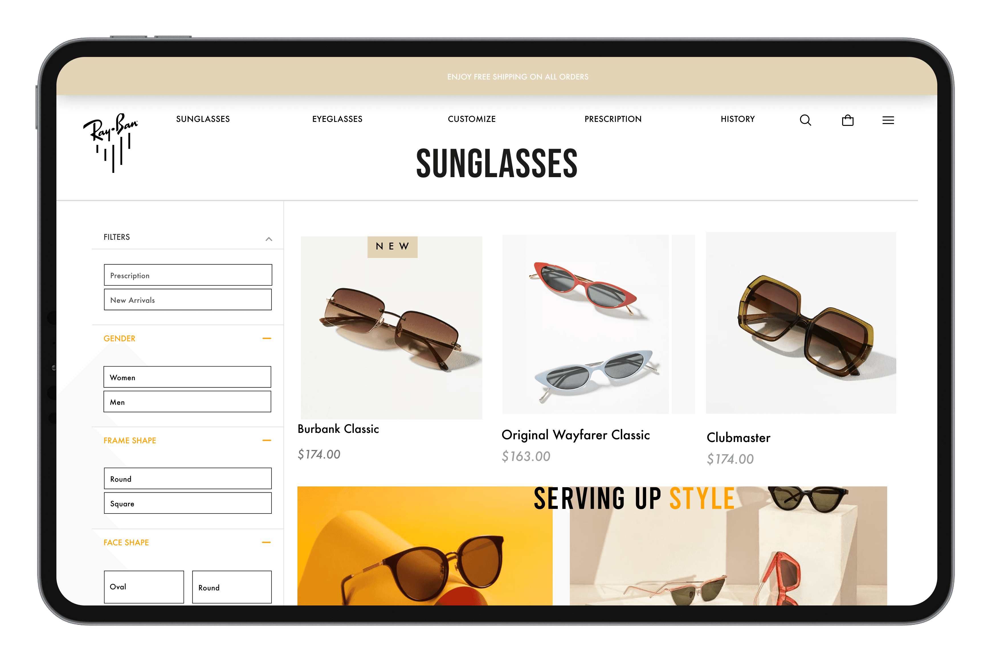
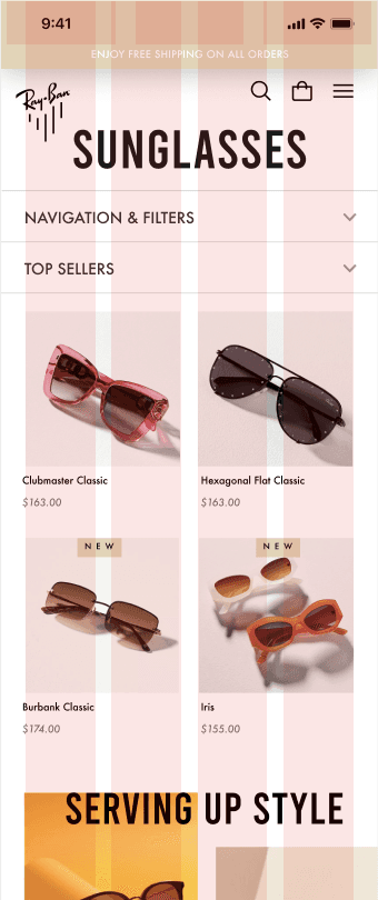
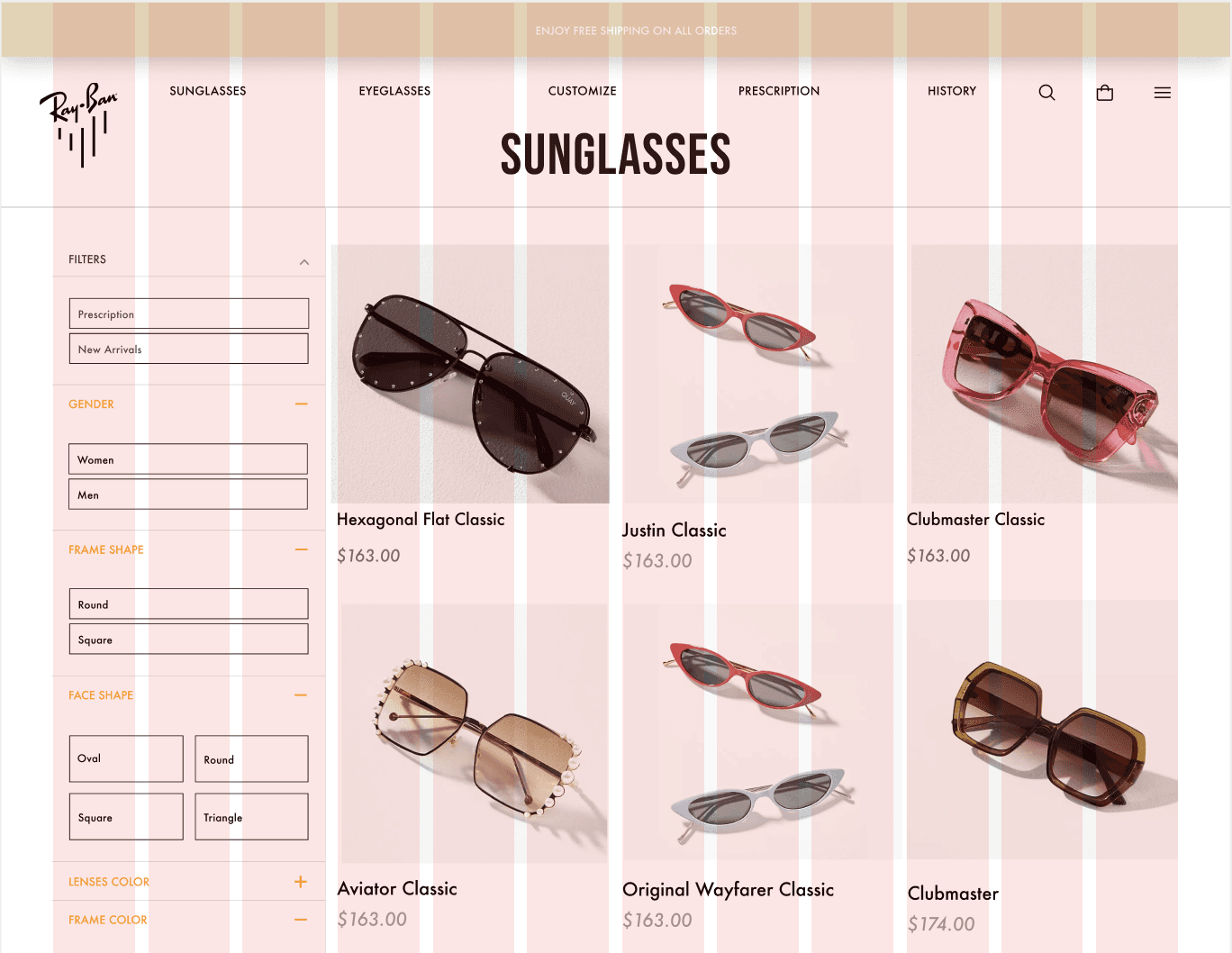
HOMEPAGE is presented with a hero image.
As user scrolls down, category and other assortments are presented.
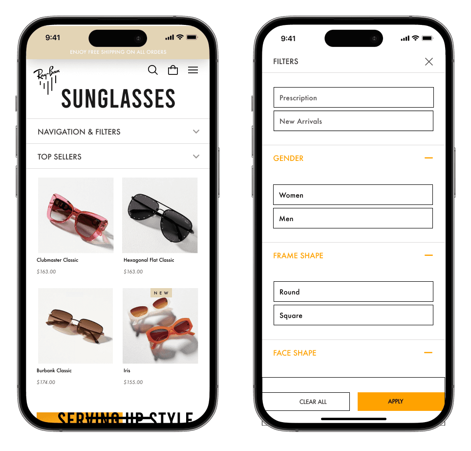
User could select options from the homepage or SEARCH for specific products using the search button.
User can also FILTER out their preferences while searching.
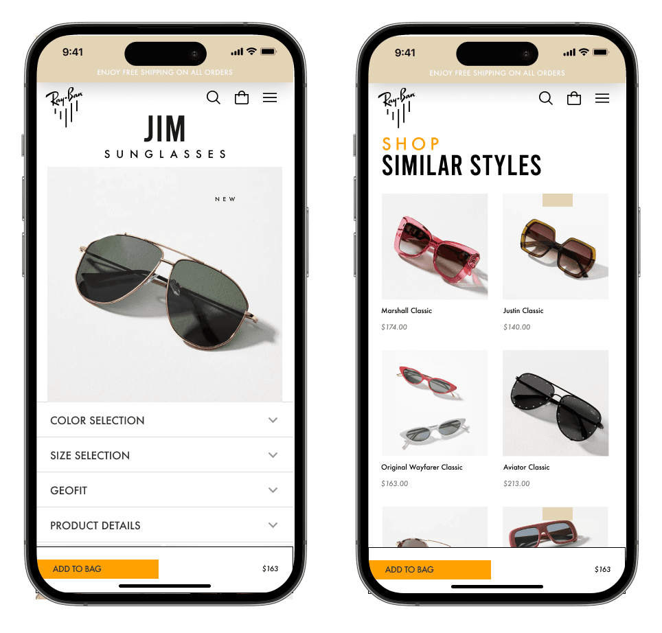
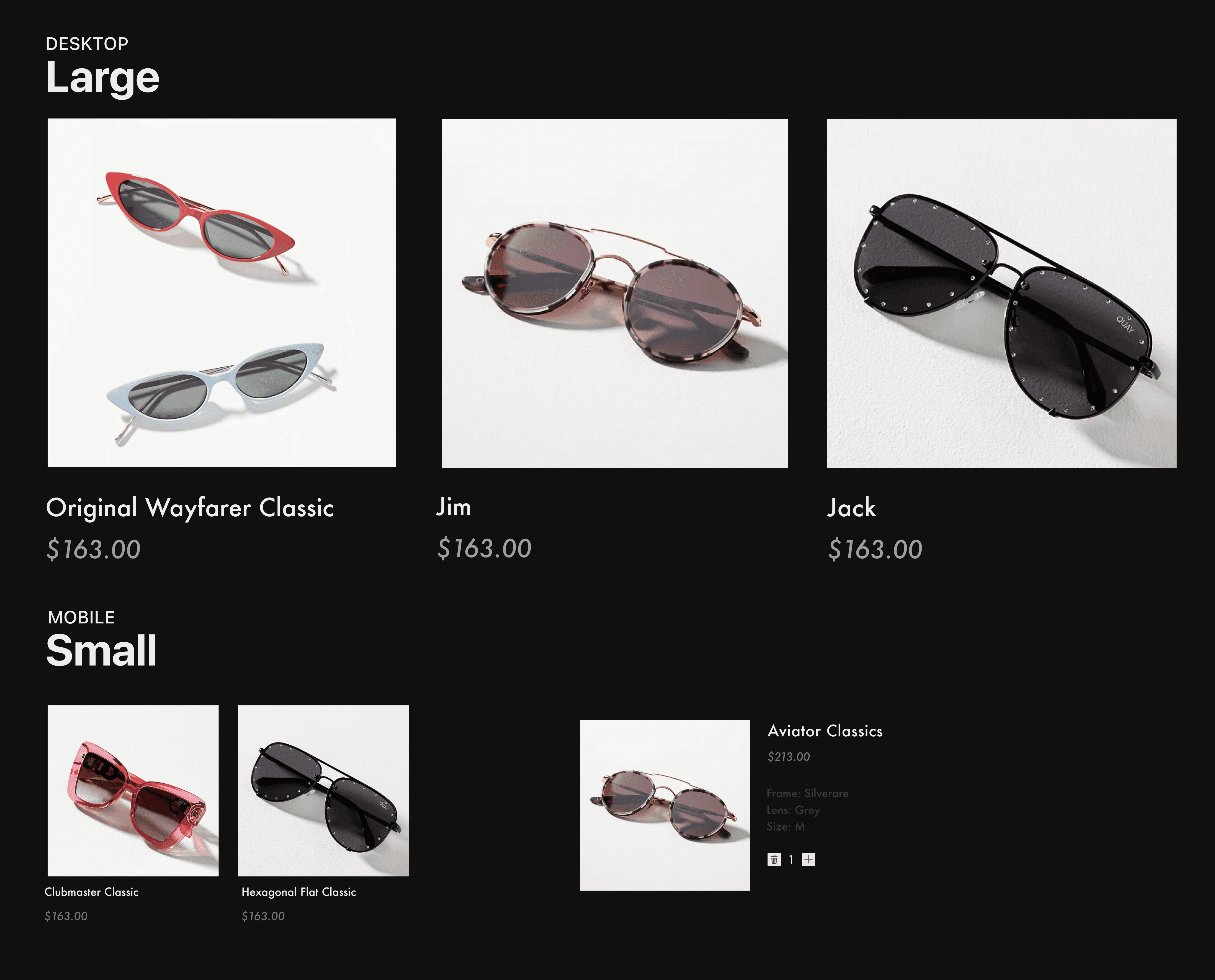
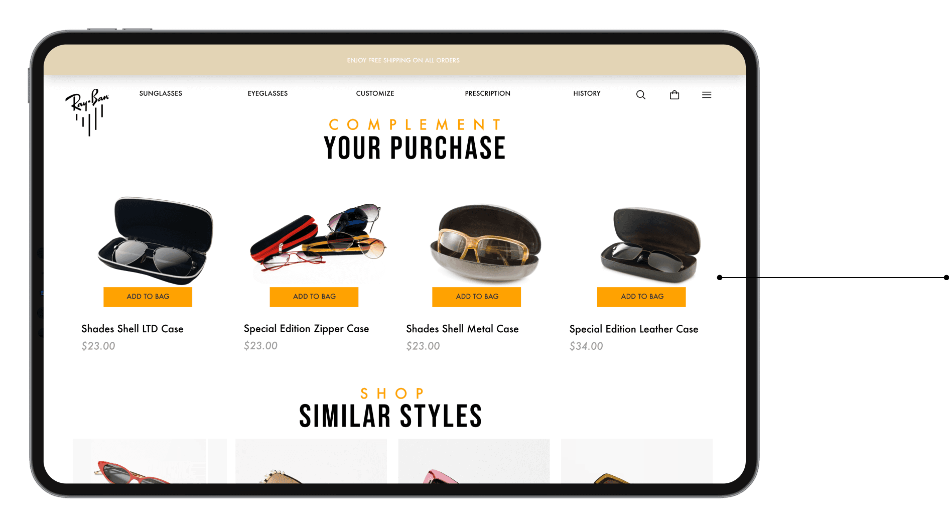
In the PRODUCT DETAIL PAGE, user can choose color and size and are exposed to other details about the product. As they scroll down they are able to view similar styles.
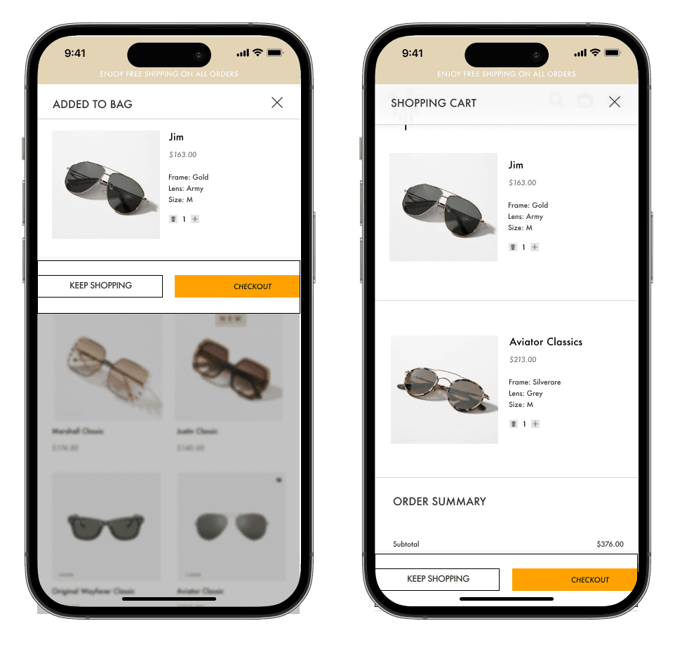
User is presented with a drop down after adding a product to their BAG. They are able to check out from that page or continue shopping.
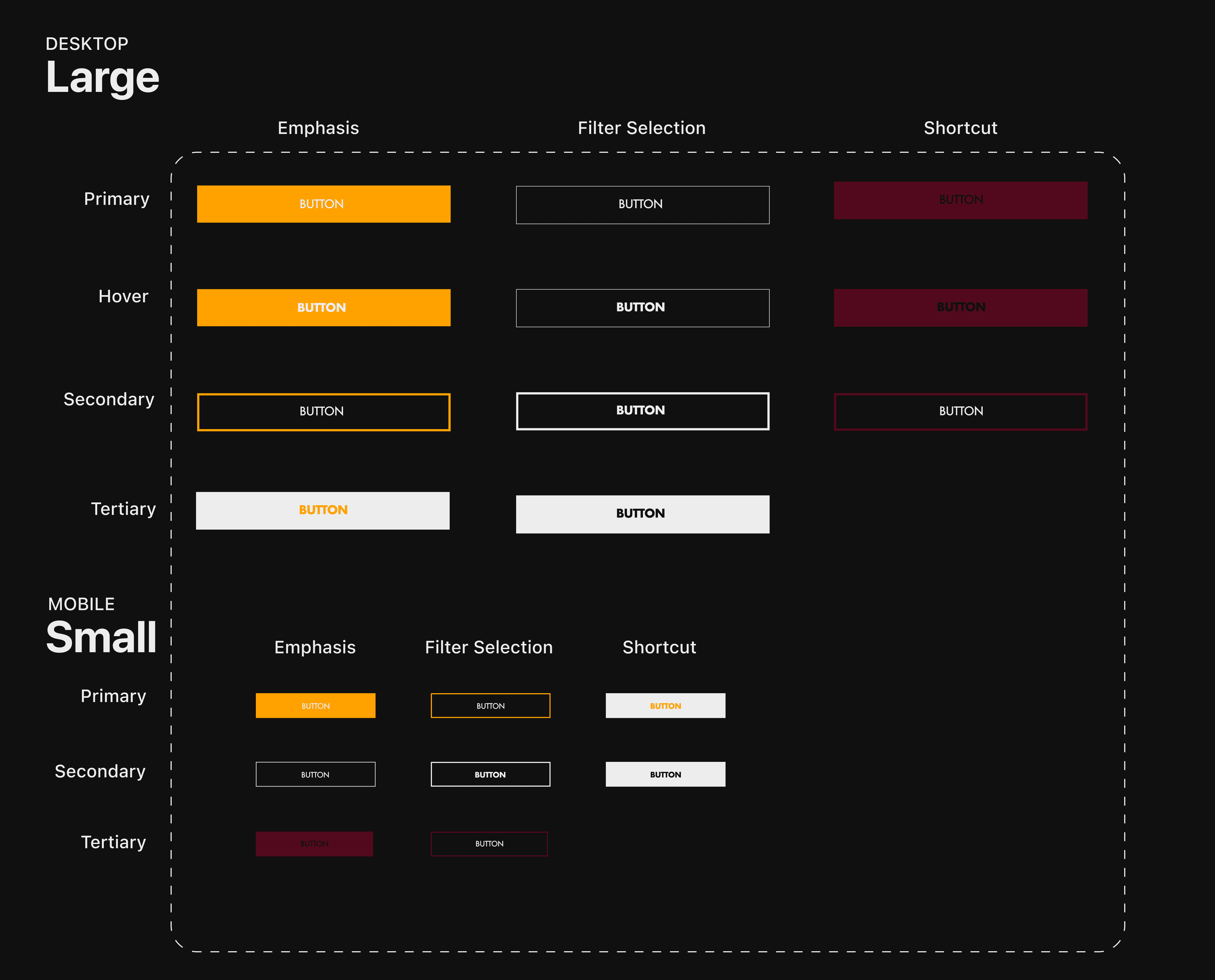

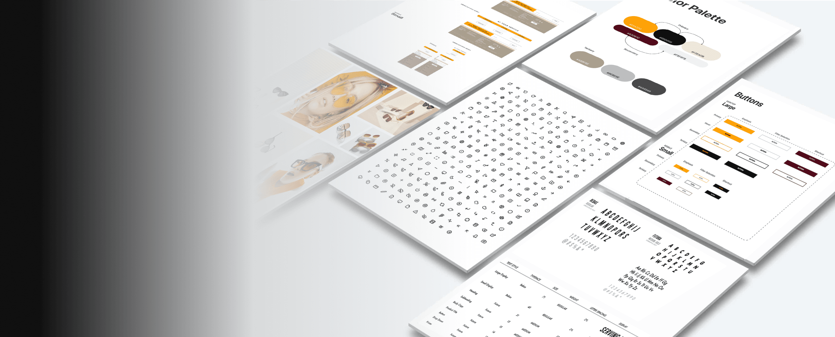
04. DESIGN SYSTEM
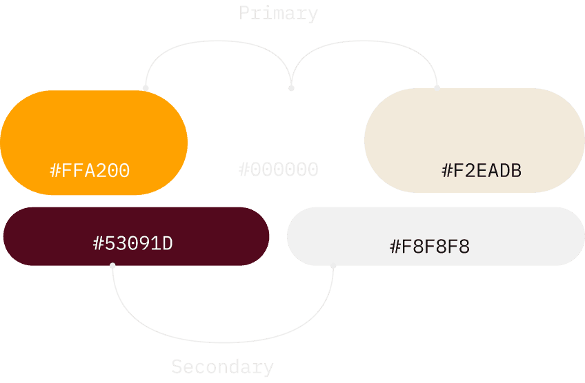
COLOR PALETTE
TYPOGRAPHY
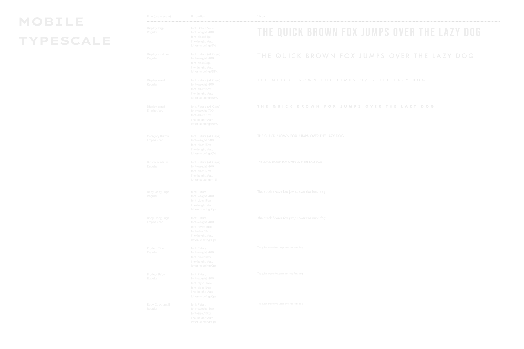

The website uses Bebas Regular for large display font and Futura for subheading and body copy.
ICON SETS
Characteristics of Icons
Icons have straight corners and may be filled for selected options.
Large icons are 24px, Medium are 20px and small icons are 8px.

05. KEY TAKEAWAY
